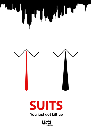
A minimal suits poster I designed

A minimal suits poster I designed
The brief for this project was very simple, just make a minimalistic style poster based around a movie or tv show that you are interested in.
The main focal point I went for was the 2 ties and collars in the middle of the page, I thought this worked really well because the show is called suits and about lawyers. The different sizes of ties are because the 2 main characters wear similar style ties to the ones depicted.
I went with the New York skyline on the top of the page because the show takes places in New York, but not only this, I felt like going with the silhouette kept with the minimal design and worked really well overall.
I tried to keep the text at the bottom of the page as similar to the original as I could. Instead of the regular tagline “Nothing is ever black and white” I replaced it with “You just got Litt up” This is a line said in the show which anyone who watches the show will recognise.

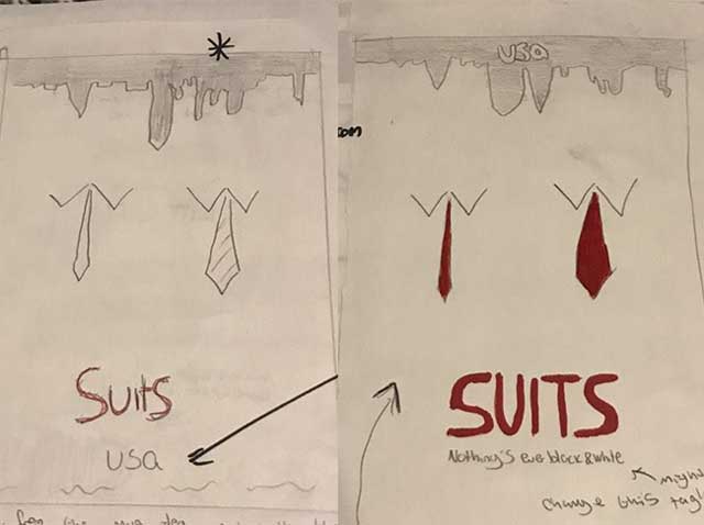
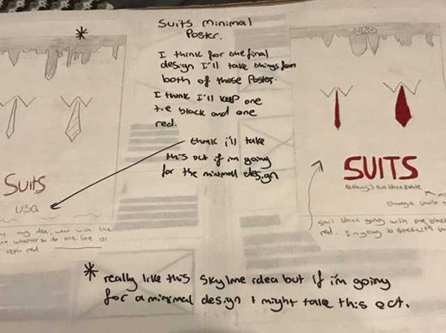
When I was starting out this project and after I got the brief I had an idea right away that I wanted to go for a suits poster, It was one of my favourite shows at the time and still is. So once I had decided that this was the poster I was going to create I did some research about suits posters and found that there was some using a skyline of New York City in it si I wanted to try something like that but make it a bit different.
After getting that idea I moved onto the idea that in the show the characters are different in the fact that one wears a thicker tie and one wears a thinner one so this was something I intended to play on and that’s how the sketches came together.